Alongside my full-time role, I partner with small businesses to build brands from the ground up: a new antiques shop, a pressure washing company, and an organic deodorant startup. Each project starts with a clear brief and ends with a brand system the owners can use everywhere.
Role
Freelance Brand Designer
Clients
3 small businesses
Timeline
2018 – 2026
Tools
Illustrator, InDesign, Photoshop
01
Antiquum
Antiques shop · Brand identity February – March 2026
Logo system
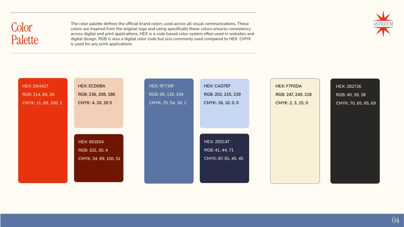
Color palette
Brand guide
Jen and Rob were launching Antiquum, a shop of curated antiques, with plans to sell through their own website, Etsy, and eBay. They needed an identity that felt established and soulful, and that worked at every size, from a storefront banner to a tiny profile picture. Their tastes differed, too: Rob leaned toward classic neutrals, while Jen wanted a pop of color.
Three concepts
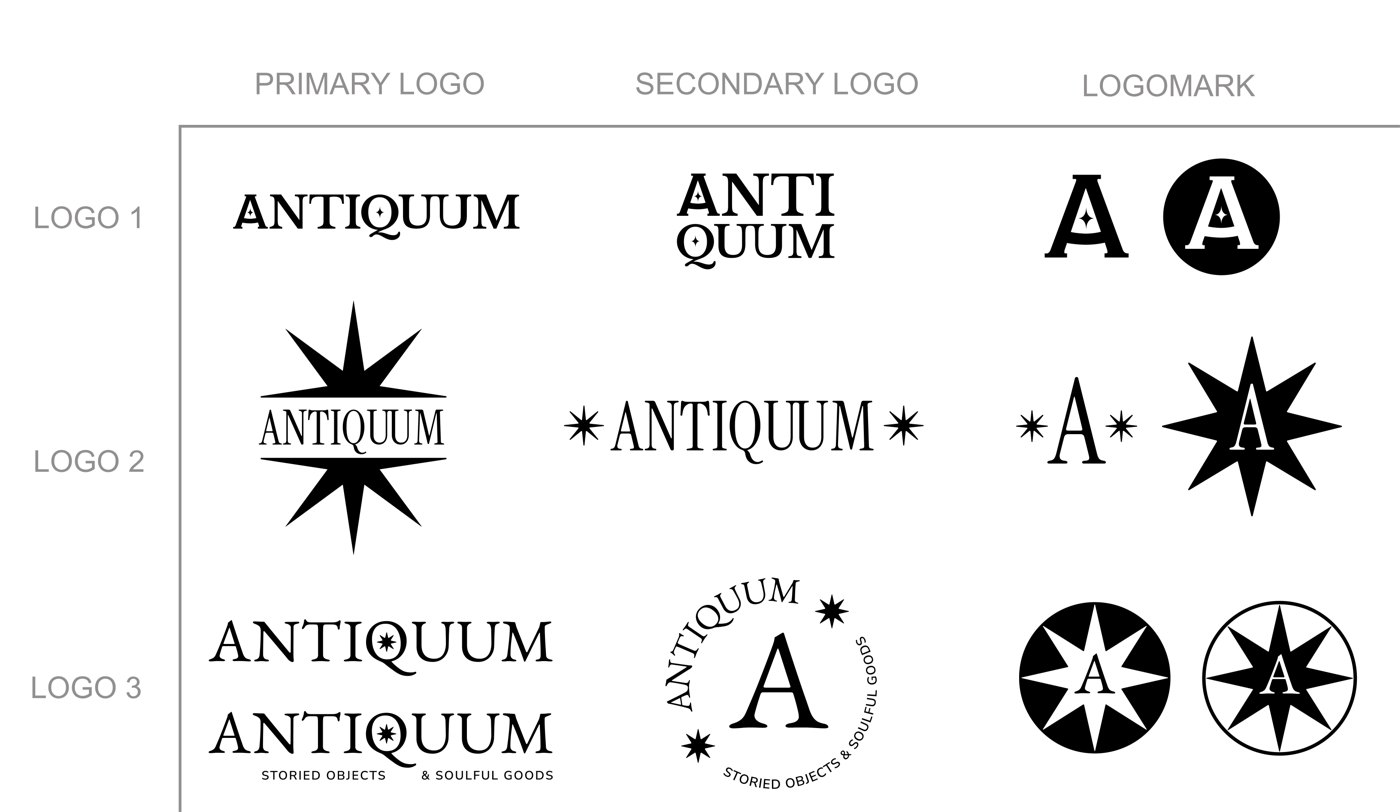
A timeless wordmark, a bold star emblem, and a heritage seal with a tagline. All three shared a star motif so the clients could mix and match the pieces they liked best.
Bridging two tastes
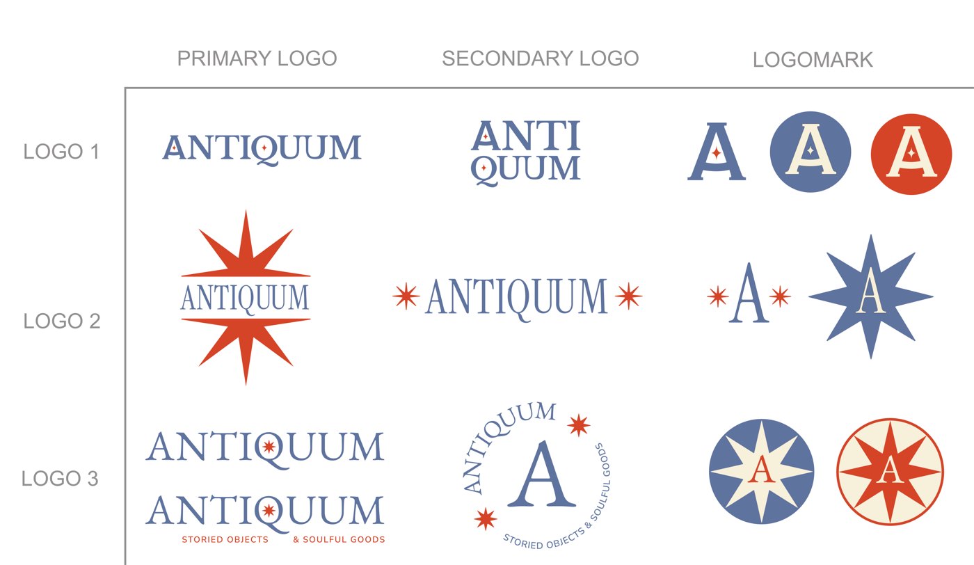
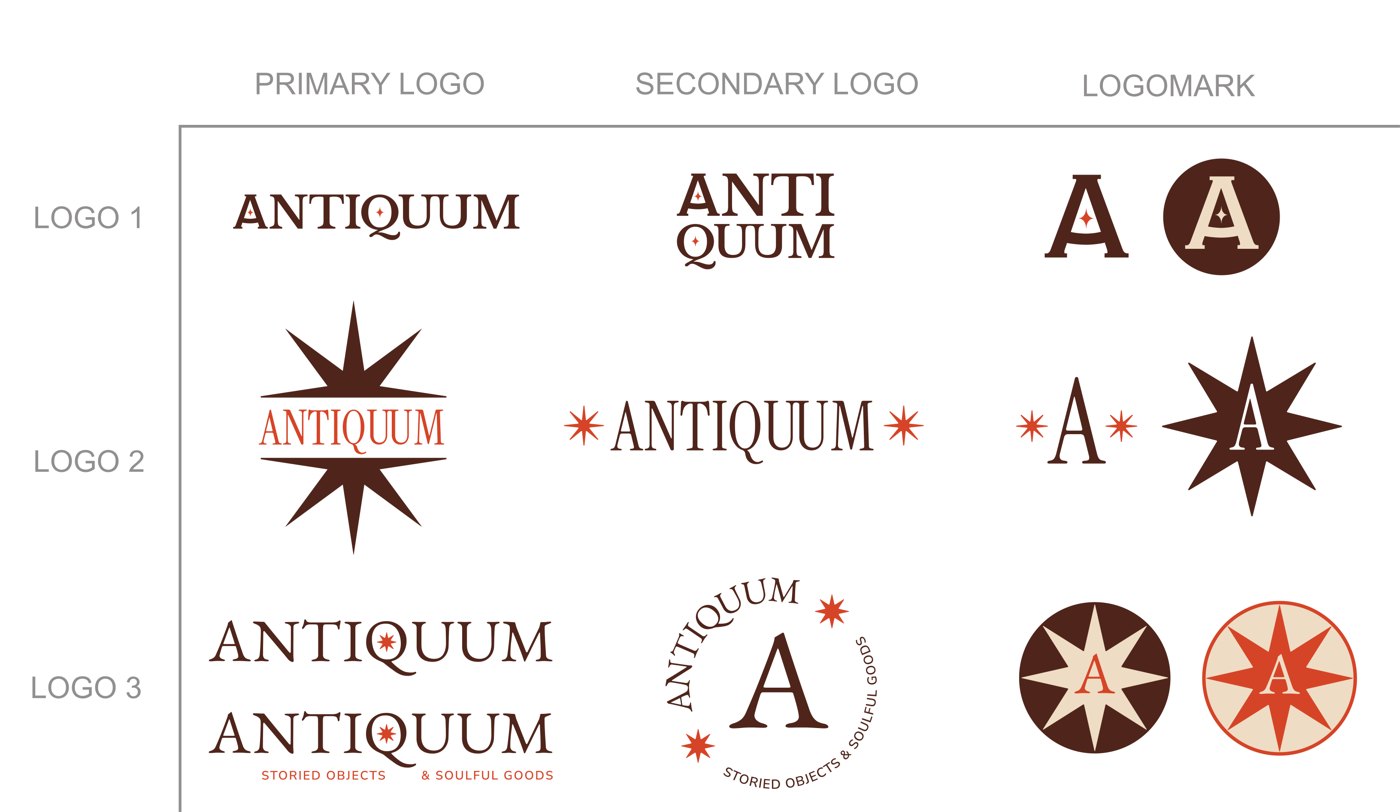
I showed every concept in black and white for Rob, blue and red-orange for Jen, and a brown and red-orange palette that blended both.
Refine for small sizes
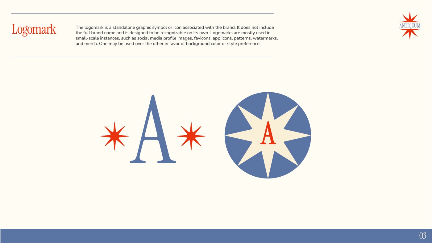
Both were immediately drawn to Concept 2. I folded in the seal idea from Concept 3, then shrank the “A” and widened the type so the logomark reads clearly as a small social profile image.
Use the arrows to page through the logo explorations and the finished brand guide.
Logo exploration: black
Logo exploration: blue and red
Logo exploration: brown and red
Brand guide: cover
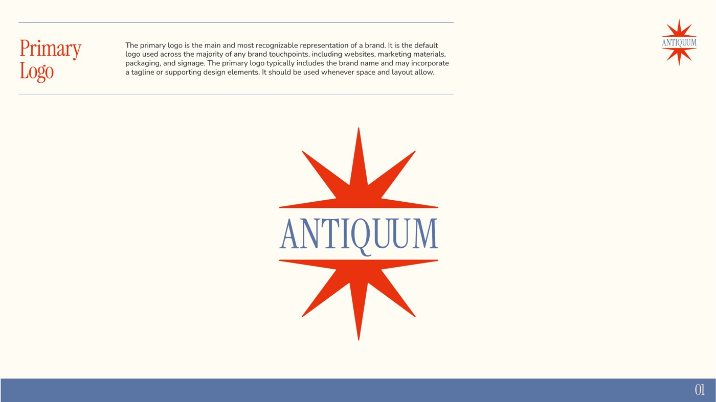
Brand guide: primary logo
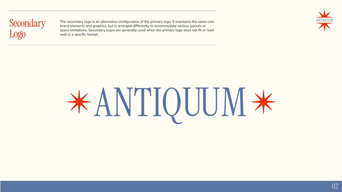
Brand guide: secondary logo
Brand guide: logomark
Brand guide: color palette
Brand guide: typography
Page {{ antqNum }} of 9
From first concepts to final brand guide in under three weeks. Jen and Rob received a complete toolkit (logos in every color variation and format, brand fonts, and working files) ready for their website and marketplace shops.
“Thank you again so much for your awesome work! We are so happy with the final product.”Jen Egan, Antiquum
02
H2O Pressure Wash
Pressure washing company · Brand refresh December 2024 – April 2025
Logo refresh
Icons
Apparel art
Brand guide
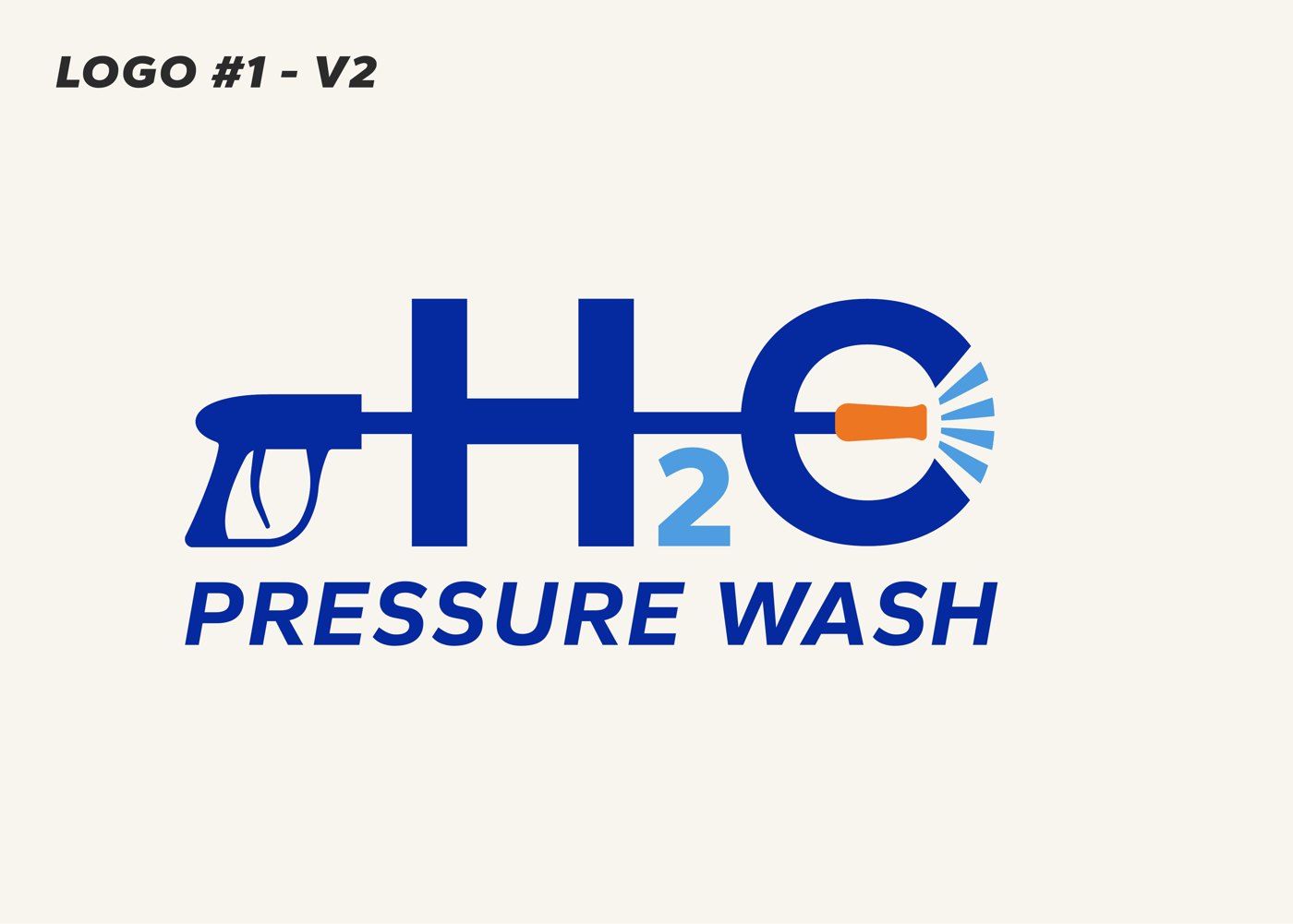
Andrew Rogers had recently taken over H2O Pressure Wash and came to me by referral with a logo from a previous designer that felt “okay, not great.” The H2O took up too much space, and the pressure wand felt awkwardly placed. He wanted a logo that was truly great before ordering apparel, redoing the website, and printing business cards, all in place by April for the busy season.
Two directions
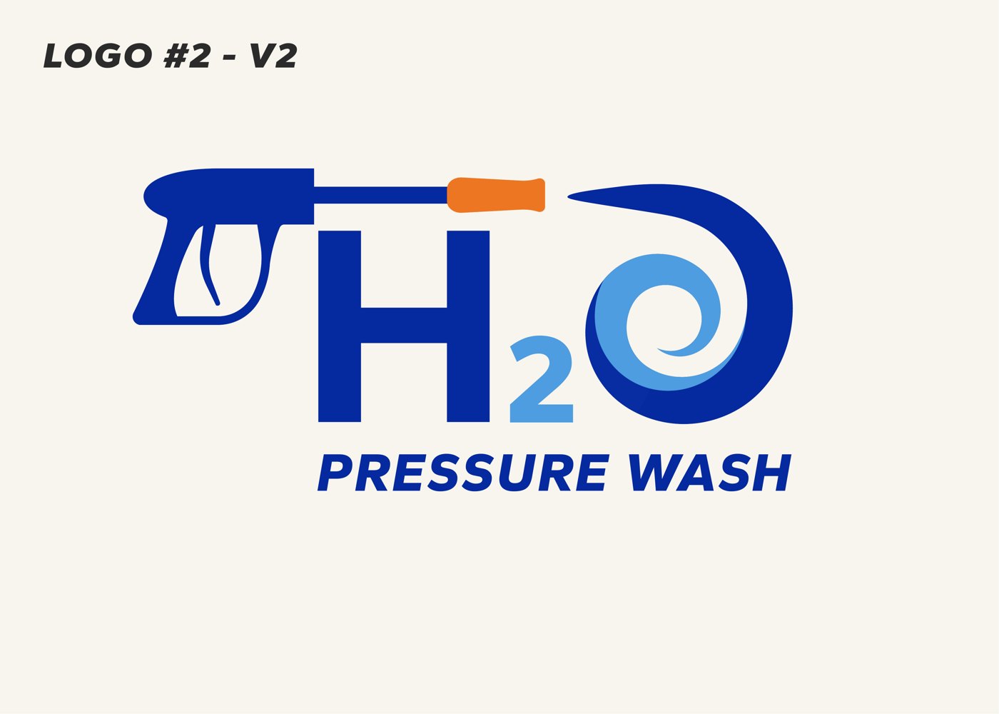
I refined his existing spray-nozzle concept and developed a new water-spiral direction, then walked through both with color and type options on a live review call.
Refine and simplify
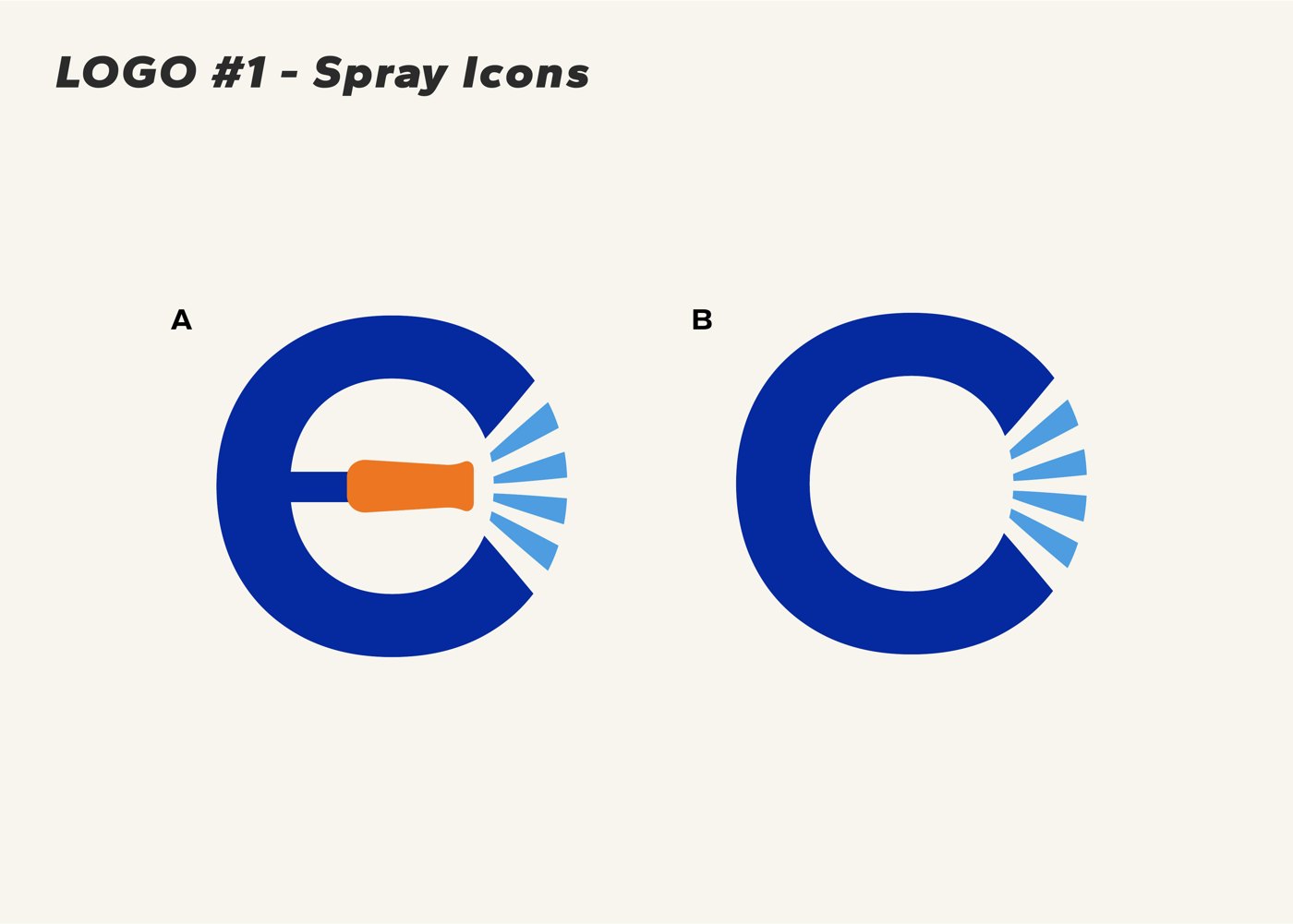
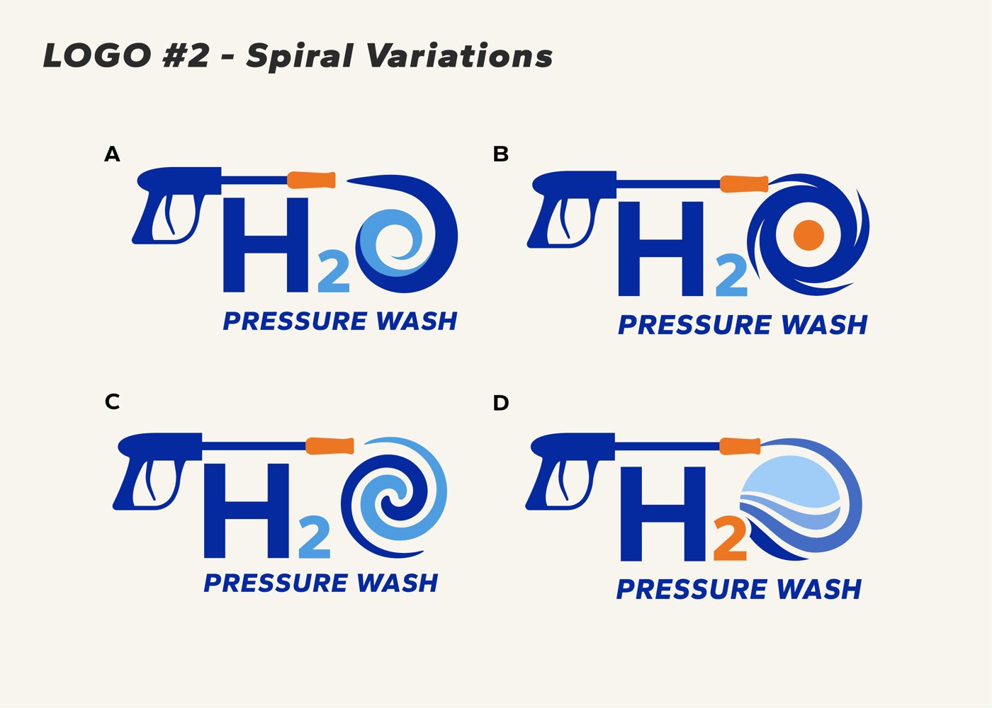
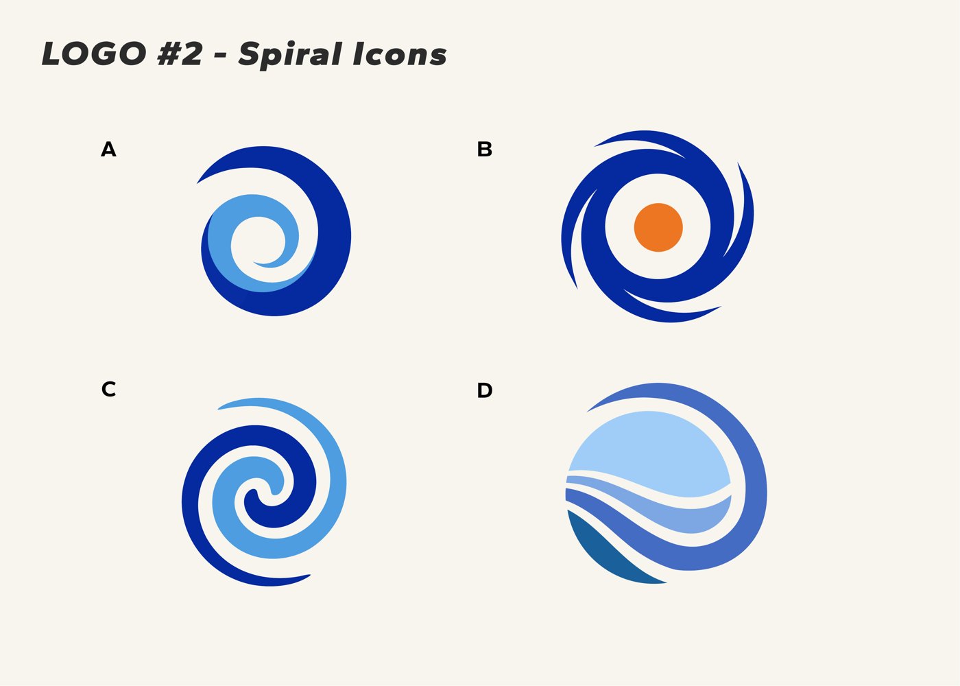
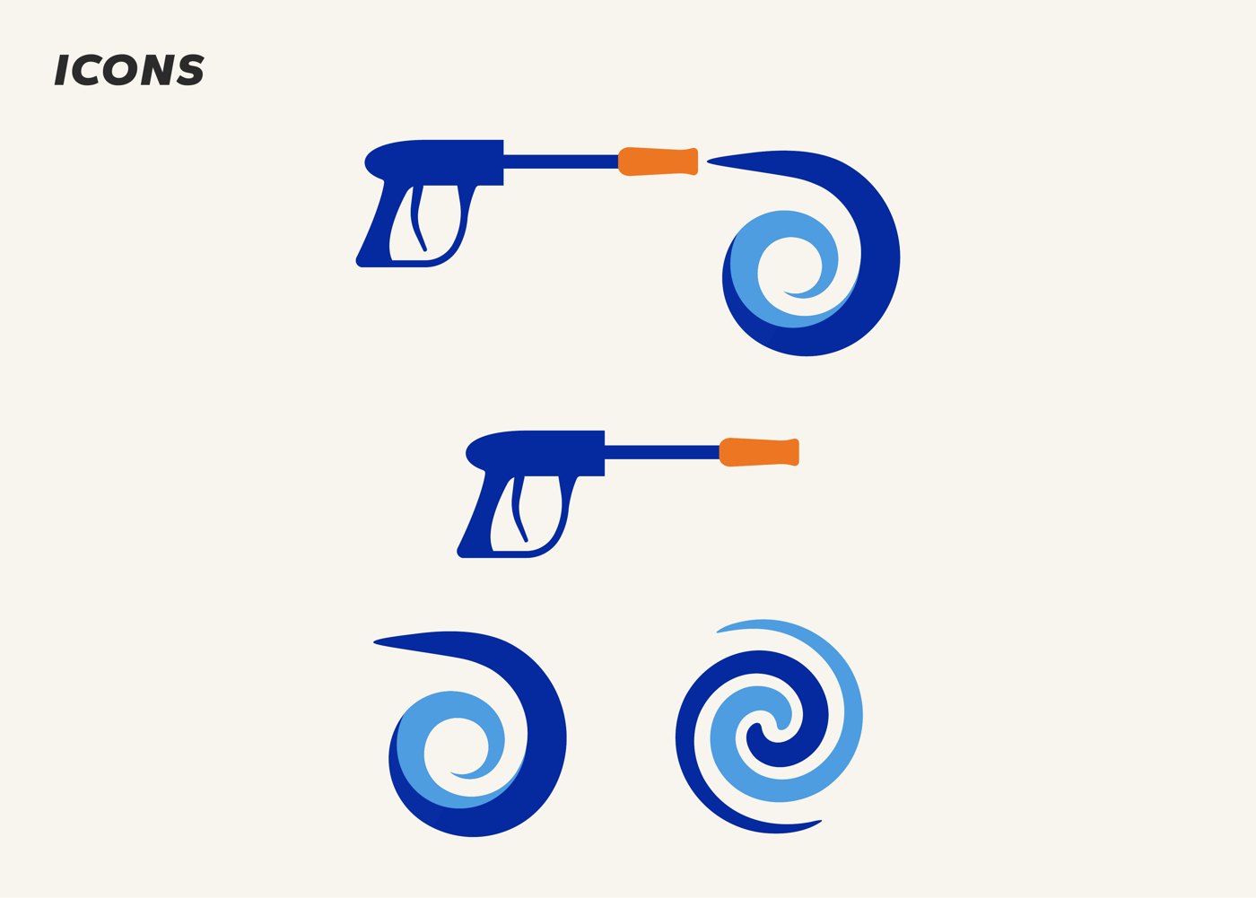
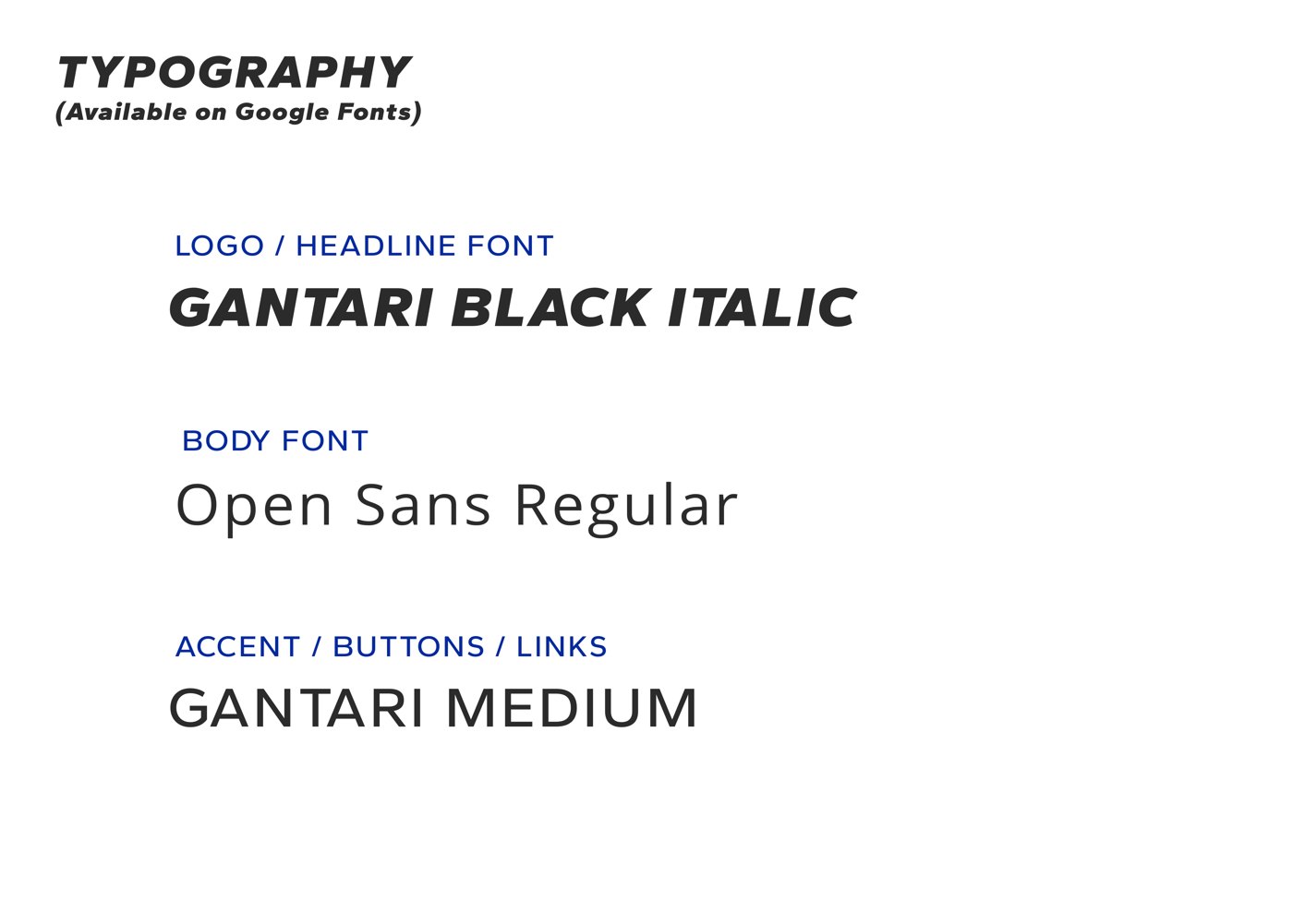
I lightened the type from Black to Semi Bold and Bold so it felt less blocky, explored four spiral variations (refining one from my original sketches), and tested standalone icons for shirts and favicons.
Systemize
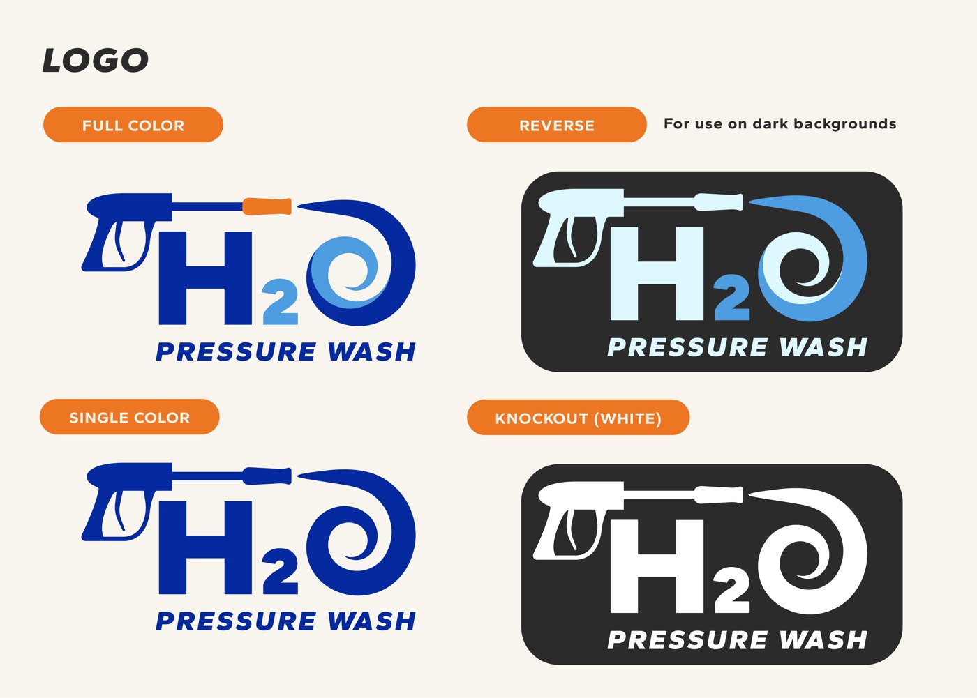
Andrew chose the spiral. I documented the final logo, colors, fonts, and icons in a brand guide and delivered every file type he’d need for print, web, and apparel.
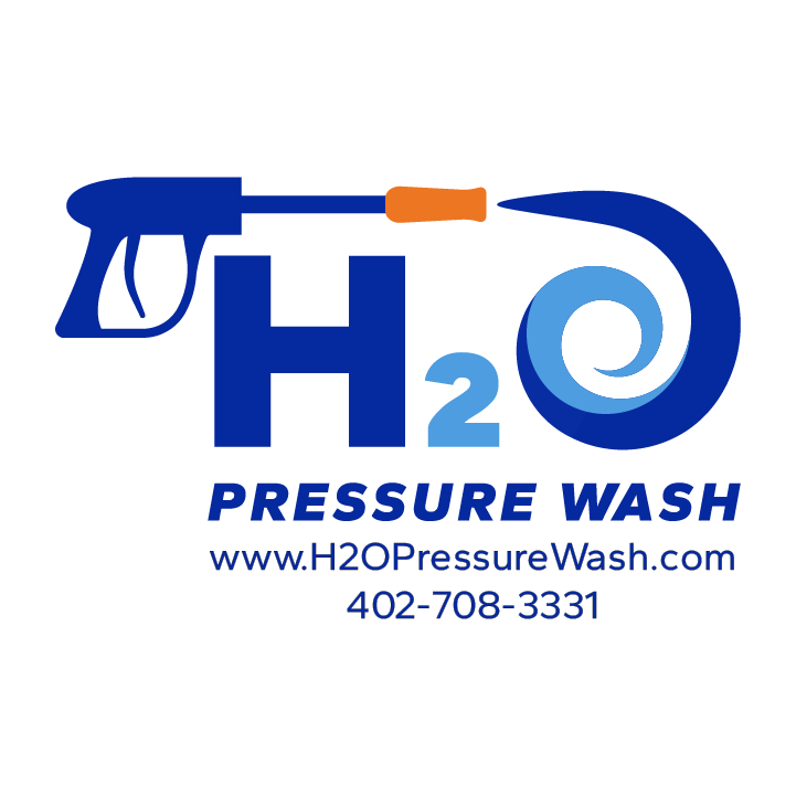
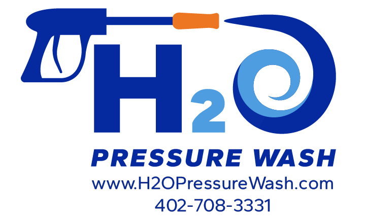
Use the arrows to page through both logo directions and the finished brand guide. The apparel artwork adds the website and phone number for the crew’s shirts.
Logo 1: spray nozzle
Logo 1: spray icons
Logo 2: spiral
Logo 2: spiral variations
Logo 2: spiral icons
Brand guide: logo versions
Brand guide: icons
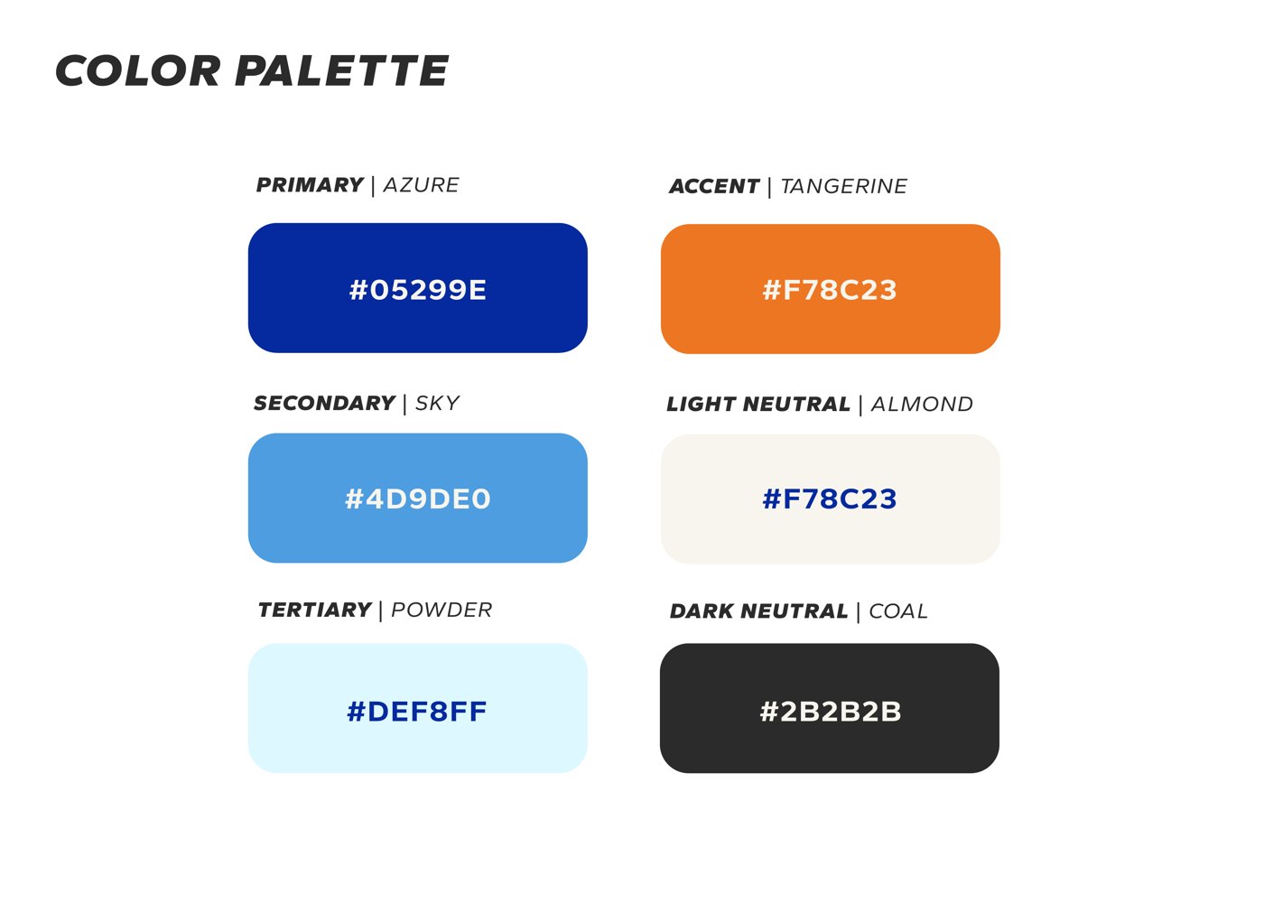
Brand guide: color palette
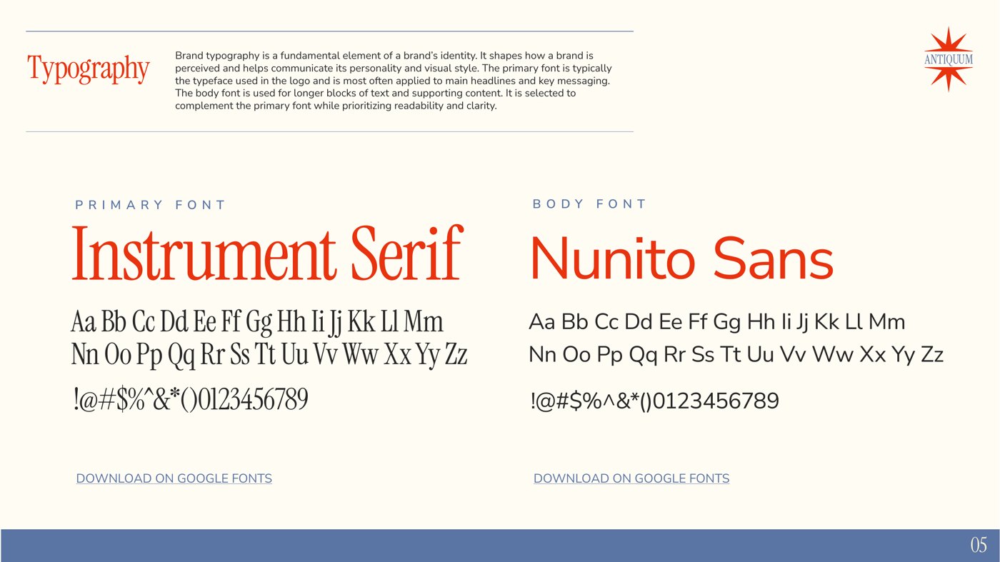
Brand guide: typography
Page {{ h2oNum }} of 9
Apparel artwork · 10 × 10 in
Apparel artwork · 10 × 6 in
The new brand was delivered ahead of the April busy season, ready for the crew’s apparel, a new website, and business cards.
03
All Out Naturals
Organic deodorant startup · Packaging & photography March 2018 – January 2019
Labels
Color system
Collateral
Photography
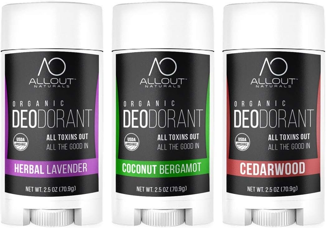
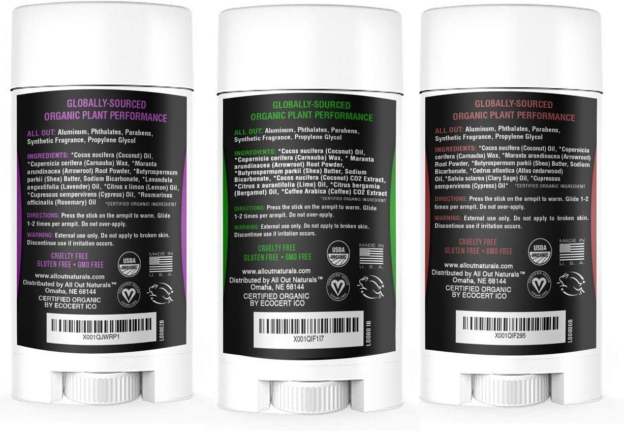
Founder Jane Merten was launching a line of organic deodorants and needed packaging that could hold its own on Amazon and store shelves while fitting a lot onto a very small label: ingredients, directions, warnings, an Amazon barcode, and four third-party certifications. What started as a label project grew into ten months of brand work, from print collateral to an eBook to lifestyle photography.
Designing for a tiny canvas
Over several rounds, we cut the marketing copy and tightened the directions to make room for larger type and certification logos. I bolded the reversed-out white text so it wouldn’t fill in when printed on black.
A color system that scales
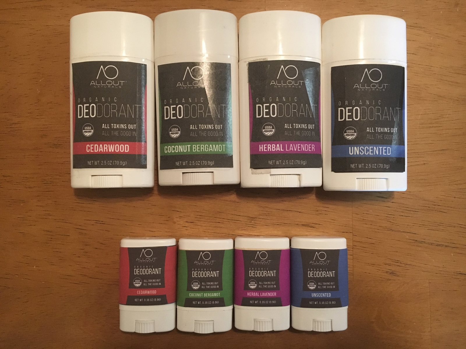
Each scent got its own color band in one shared layout. When the trial sizes came back, I carried the color curve further across the standard labels and bled every band to the edge.
Bridging design and print
Acting as the technical lead with the printer, I matched each scent’s flat color to a cold-foil metallic, then delivered packaged files with fonts and label numbers for version control.
Label system
One layout, with a color band that changes for each scent, so the whole line reads as a family.
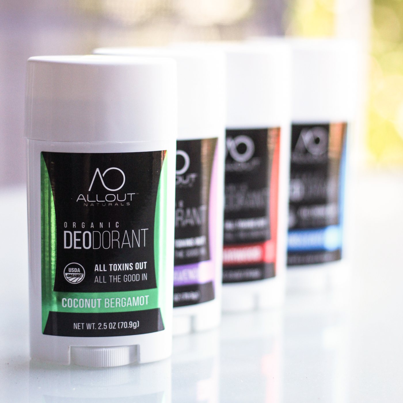
Label system across four scents
One layout, with a color band that changes for each scent.
The full line, printed. Four scents in standard and trial sizes, each with its own color band.
Beyond the label
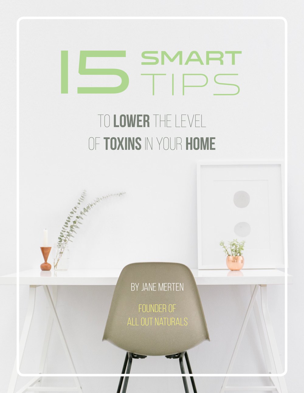
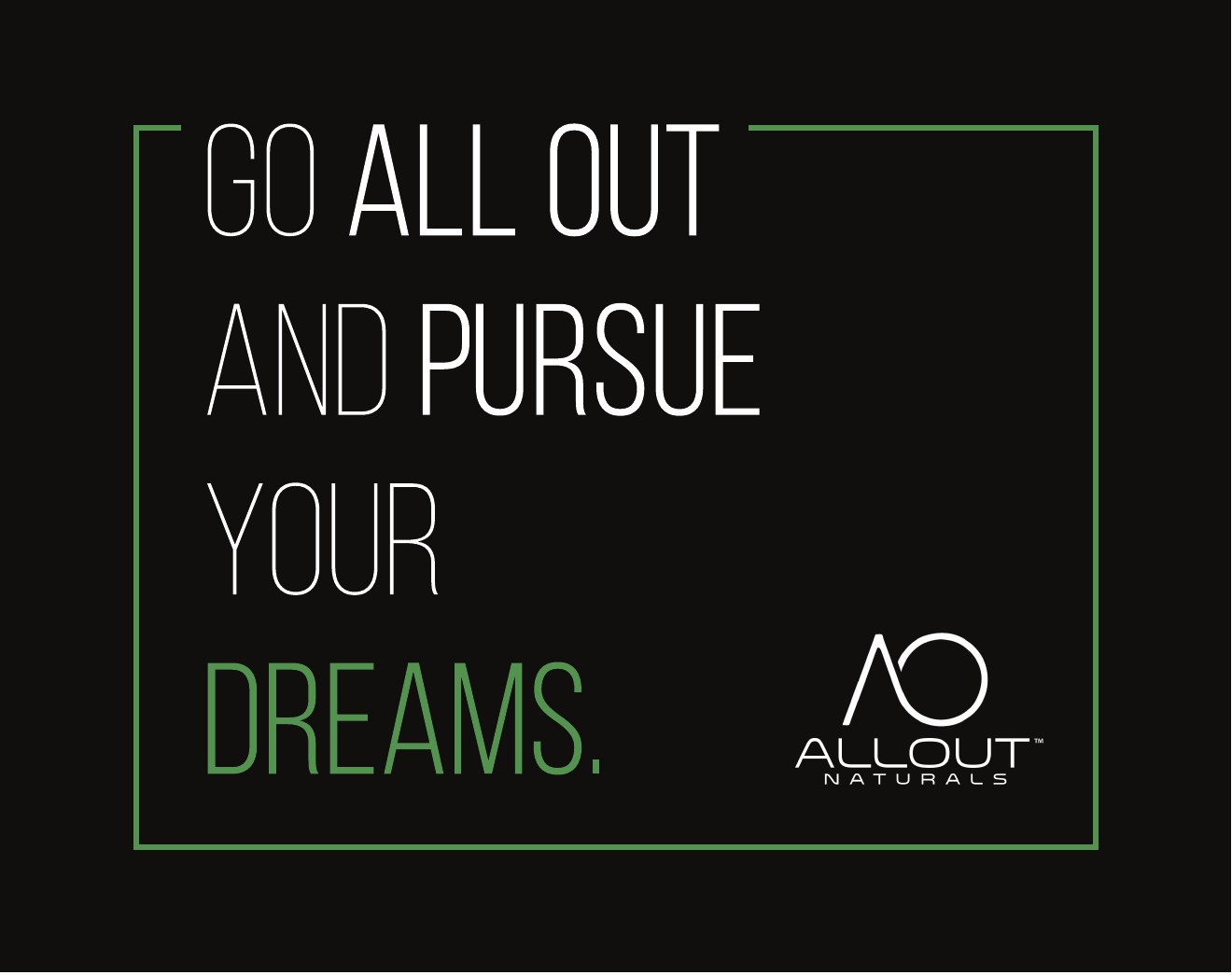
As the brand grew, so did the work. I redesigned Jane’s lead-magnet eBook and created thank-you notecards and stickers that carried the label’s black, bold type and metallic accents into every order.
“15 Smart Tips” eBook redesign
Thank-you notecard, front
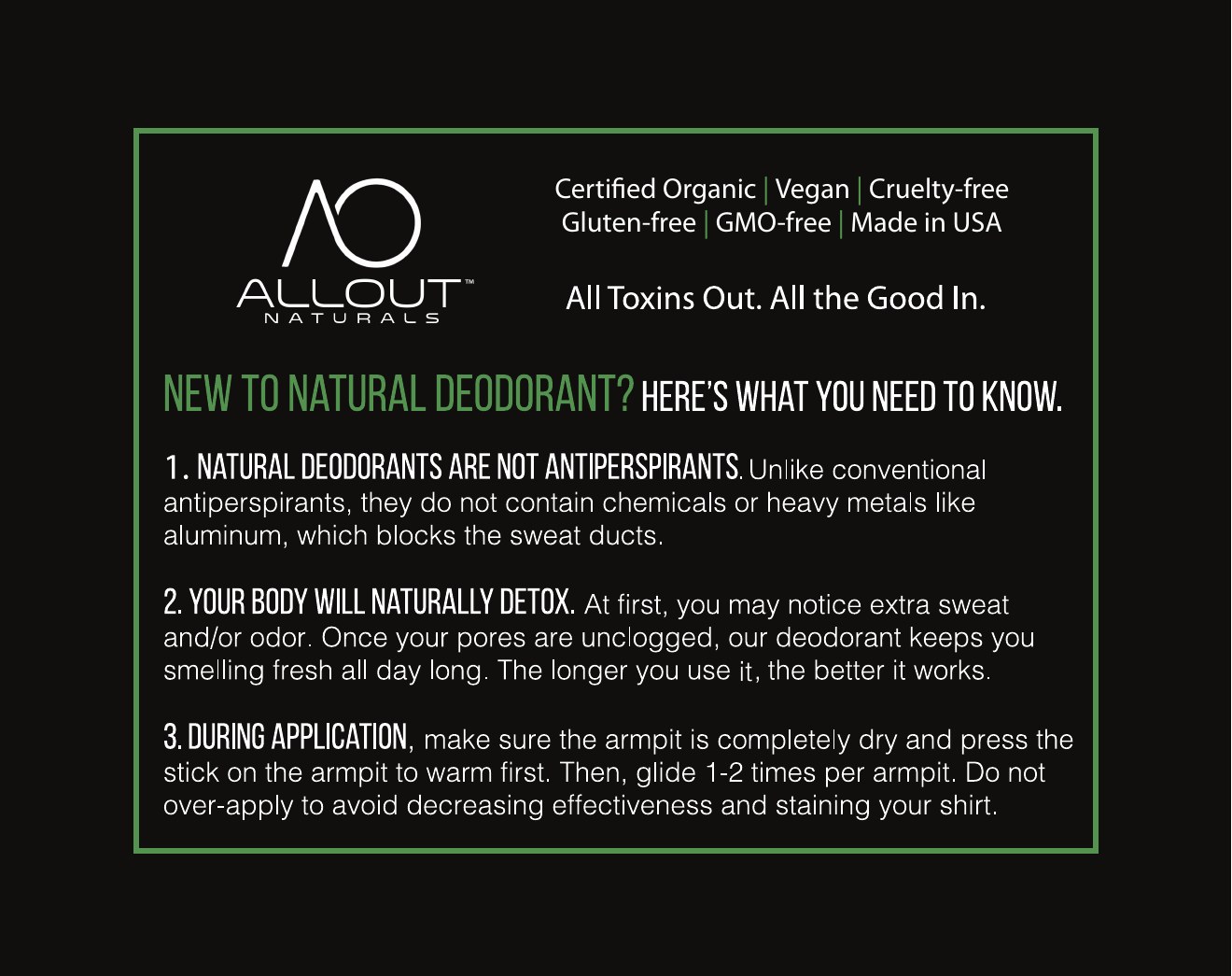
Notecard back: tips for new natural-deodorant users
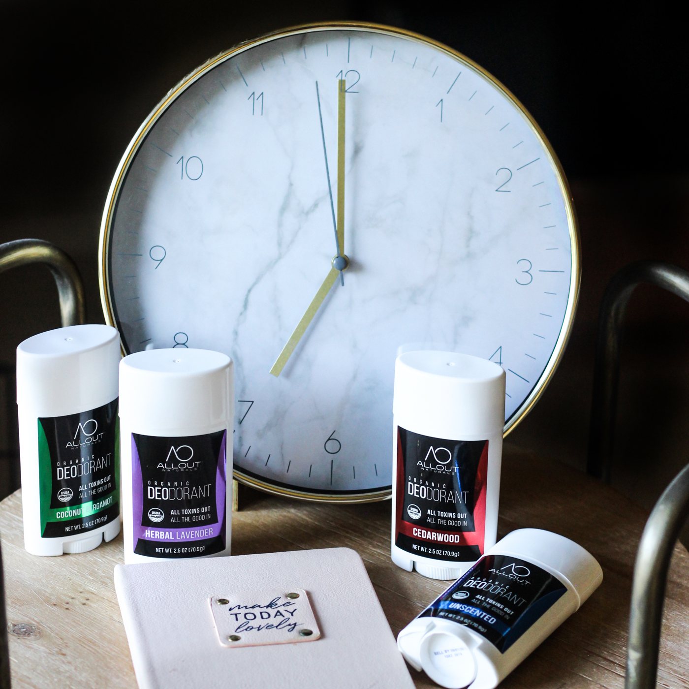
Product photography
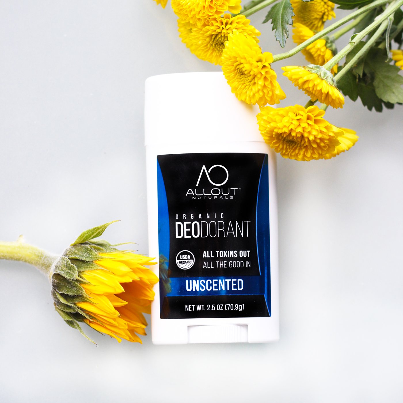
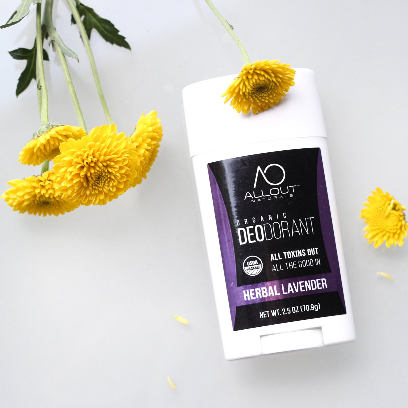
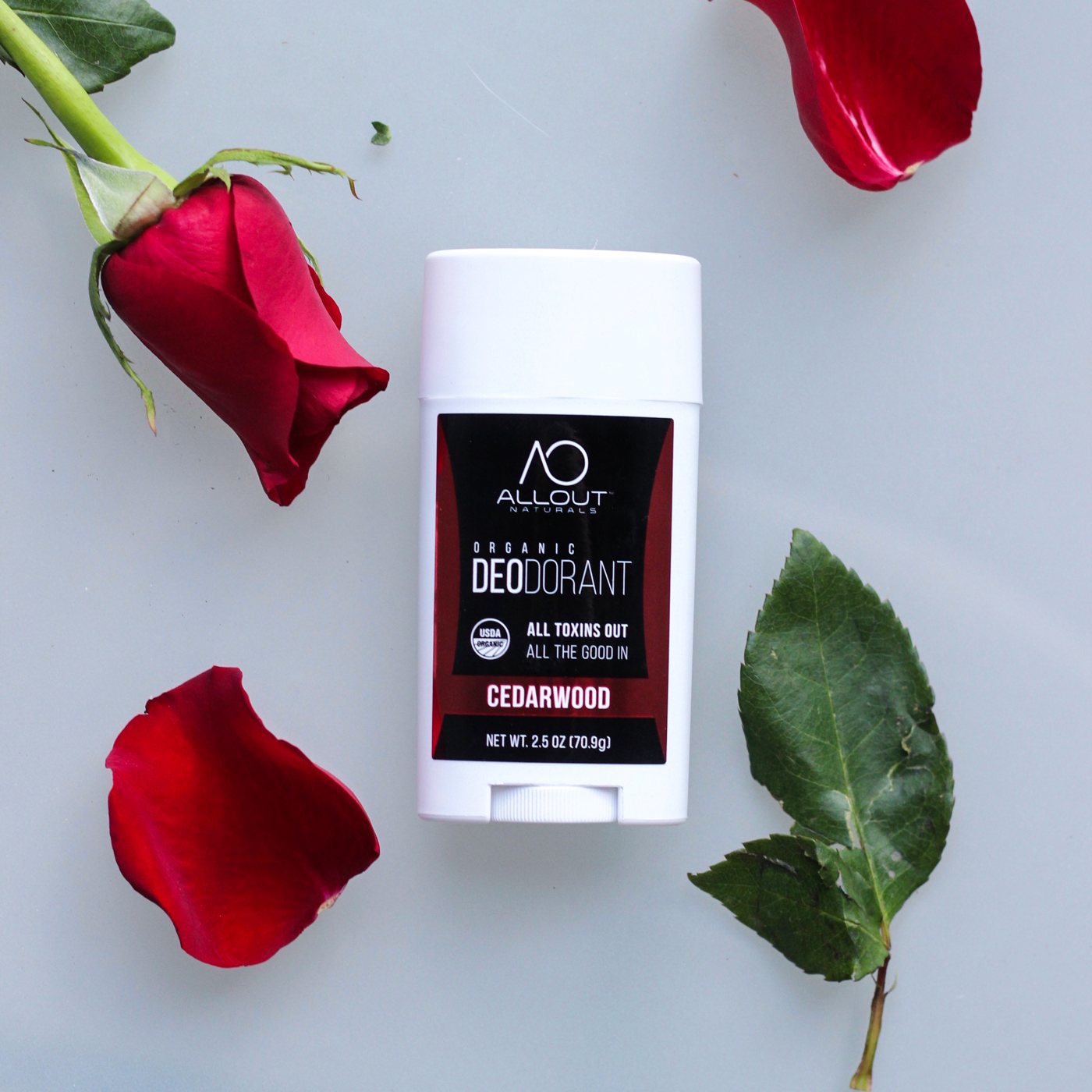
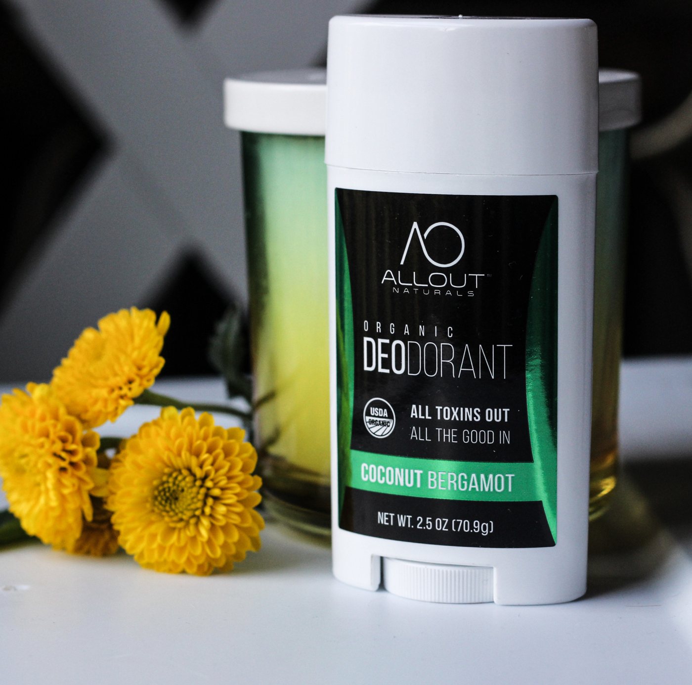
Styled photos for the website and social media, plus seasonal shoots and countdown graphics for a 12 Days of Christmas Instagram giveaway. Click any photo to view it larger.
Photo {{ photoNum }} of 6
The labels were approved and quoted for a first run of 2,500 per scent and size. Jane returned for 10+ more projects over the following months, and the work carried from the shelf into the brand’s social presence.